24h00 variant is objectively the most reasonable, just like the metric system. If I can do am/pm then Americans should be able to figure out that 18h00 is 6pm.
I have no preference with the time format, as long as it is not that retarded "3 days ago" thing.
I suggest timestamps on posts, so we can see when each post was posted.
Also, maybe this should go in the bugs thread, but my pm chats have issues scrolling down automatically when the original space for the chat is filled. I mean I am stuck seeing just the first part of a pm, and new lines that go below, I have to scroll to by down arrow because they are not visible.
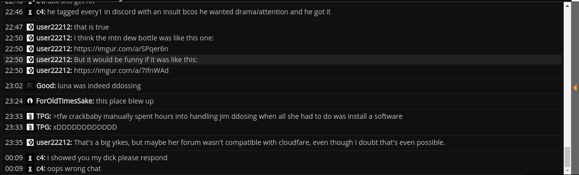
I just want other people to read this shit and be confused whether it's part of the post or not.
It makes no sense to have search results in chronological order as opposed to "newest first". For example, if you want to see posts from a specific user, or posts where someone mentioned you or a specific topic, while you were absent from the forum, it is quite a pain in the ass.
Also, we get no results if we type more than one word, unless they are in the exact specific order in the post (ex: "music suit mood" will not return results unless you post "music to suit your mood"). Sometimes we don't remember the search terms that well, just a few words from a post, and that should be enough.
I just want other people to read this shit and be confused whether it's part of the post or not.
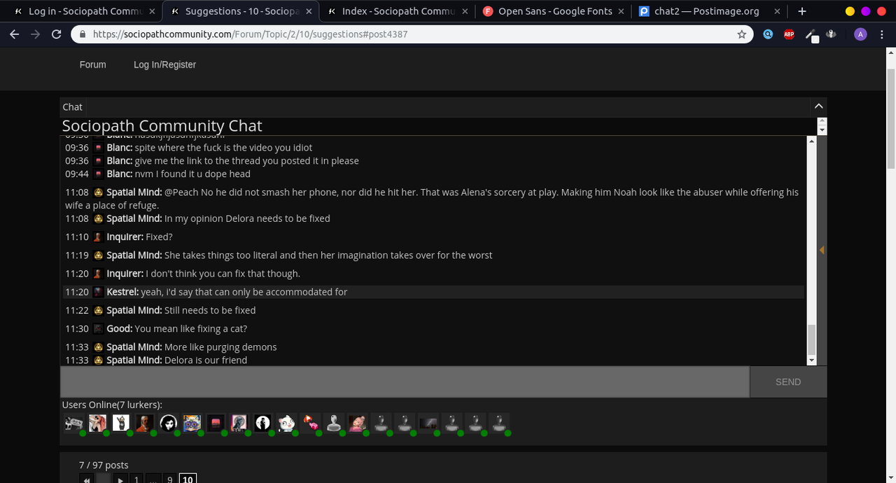
adding a bit of margin in the chat makes it look a lot better, imo. i also tried source sans pro as a font
edit: full size link
the dividers between users probably wouldn't be necessary anymore. i would have taken it out for the preview, but it seems to be hidden somewhere annoying
last edit on
5/9/2019 12:49:27 AM
i wasn't seeing anything about a border in the styling last night, then i read that and found it first inspect. wowee. anyways i think it looks slightly better w/o the border, altho at this point it's a debate on aesthetics. also open sans is a well-loved font in the design community, no one is fucking with droid sans.
CUSTOM EMOJIS
CUSTOM EMOJIS
Just post it as an image like I do. 
Ę̵̚x̸͎̾i̴͚̽s̵̻͐t̷͐ͅe̷̯͠n̴̤̚t̵̻̅i̵͉̿a̴̮͊l̵͍̂ ̴̹̕D̵̤̀e̸͓͂t̵̢͂e̴͕̓c̸̗̄t̴̗̿ï̶̪v̷̲̍é̵͔