im concerned these are both too warm for me but they look comparable to like, chantacalle and dior, and chanel, high end stuff eh- i'm not one to grab cream products but this one made me open to trying and seeing. it would be an experiment for sure.
not mad at this at all though, def would pick up the light
last edit on
12/31/2024 10:37:49 AM


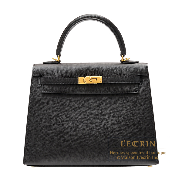


i got a new bag? it's not, this one but really similar with newer hardware, kelly 25 sellier epsom
similar to the darker one, again just newer hardware and in the sellier epsom. it has similar horse and eh... twilly. lol
i'll post a pic of it later. it's obviously not authentic so it actually has a nice like, detail to it that would be really rare to find in an authentic hermes kelly so, lmfao- so that's the nice thing about fakes is you get to have really interesting versions that are otherwise 'impossible' to get
i'm really happy with it, i didn't like, think of myself as the kind of person who would go out of my way to get one, i've always been fond of the kelly sellier epsom-
but when i happen to pass by it in a store, it just stood out to me as the cutest 'must have' thing in the store and then when i tried it on i realized why people like these bags as much as they do,
they look cute and sophisticated at the same time, and there's no frumpyness to it, so it makes you look really put together. i tend to look better in clothes/bag and things like that that have a bit of structure to them, just my opinion,
it's the polar opposite of frumpy, which is exactly what i needed- and very like, upscale, classy look that you almost don't see in any other bag
the coloring was just right for me personally, like it went with my tones and such complimenting everything really well,
so yeah i'd always known i liked that size and structure type eh, once i tried it on it was just like 'oh yeah, this looks good.' lol
and that never happens w/ me, the fact it was an immediate *love* is a big deal for me, i don't normally like most things right away. but, what do you expect, it's a birkin.
told myself i wouldn't get too into it because it's over done but, i don't care. it looks really nice, it's really cute, it brings me joy and inspiration fashion wise,
it's, if you find the right one for you eh, it's kind of a must have thing in your thing of things lol
the nice part is, it isn't real so, when if i get tired of it in a year worst case scenario, don't have to worry about it. :)
Oh Mary, oh Mary ! He should've chosen you ! Oh how better it would've been to be in the friendzone with you than to run to Quintasia ! Oh Mary ! It was you all along ! Mark my words, for it's been proven a peck on the cheek from you is greater than intercourse with her !
What.
Ę̵̚x̸͎̾i̴͚̽s̵̻͐t̷͐ͅe̷̯͠n̴̤̚t̵̻̅i̵͉̿a̴̮͊l̵͍̂ ̴̹̕D̵̤̀e̸͓͂t̵̢͂e̴͕̓c̸̗̄t̴̗̿ï̶̪v̷̲̍é̵͔
Okay so lesson learned, if you're bored with Target, try going to other targets you haven't been to before. They're completely different, like, they're all sort of unique so you'll get to see 'in person' different items to spark your inspiration and creativity, interest.
The thing I thought was interesting this time, something different for 2025 for sure- is the items in the bullseye playground.
in previous years, it seems like it was dominated by things that were
-miniature
-low quality manufacture
-slightly weird renditions of trendy things across random consumer markets
-predominately things for kids
but this year was starting fresh with a whole new take on the 'dollar section' giving the consumer really good deals on high yield products that people 'want' but on average, don't have the 'extra' money to waste on- when it's priced too high.
for example- they had a BUNCH (i mean they really tried to cover all their bases) of items that have been popular online as amazon favorites- viral home organization / home related products that are 'aesthetic' and pretty (kind of scandinavian, clean look, modern). they were all cohesive in design, as well- across all the 'home organizing / home related' products they rolled out in the bullseye playground for 2025- almost making it look like a brand of its own.
but the best part was that these items, even on amazon, or ordered with amazon prime, still came out to be all together- way higher total, and less cohesive manufacture / aesthetic over all. this was a one stop shop, everything went together, everything made by the same manufacture, from the exact same materials you like. so it's extremely, easy and cohesive-
all, individually, the items- at prices, you cannot, beat. we're talking $3-$5 for things that i've seen usually at $25, $35, even above $50 dollars each item individually- easily. Why? Just because it "looks nice."
But now, you can have something that 'looks nice' is a good size, and functional good materials, cohesive aesthetic- all in one place, for way, way, less- beating even amazon, prices- and prime convenience. the best part is, if you hate it all- you can return it all because of targets amazing return policies. there's even drive up and pick up options that make it *really* easy and accessible... and more immediate- more convenient, than amazon.
this right here, i'm impressed with because, i haven't seen many brands take on the 'home organization products / home-making products' aesthetic matchy matchy modern super organized amazon 'home' things viral internet trend too seriously- and i see some massive volume in it- so i don't see why not.
the brands that *have* dipped their toes in, and tried to deliver some great quality products, with cohesive brand image or aesthetic across all products- very trendy, very mid-upscale, very nice- but the price point was just, too, high. Even at walmart, with brands like 'the home edit'.... $15 for an acyrlic bucket, had you wandering to TJ Maxx / Marshalls / HomeGoods etc, to try and make it work.
even the dollar stores have tried to get in on the trend, but the products they were offering were not quite 'on the mark' aesthetically or quality wise.
obviously, the container store you'd think- would have this one in the bag. and when the trend was first surging, a lot of people did go there just for the convenience to get everything with a matching aesthetic, good quality, all in one go, convenient place to work from on this kind of project so if you're off and need to add something or take away something, you can come back to the container store to keep working on it. they did a decent job at having a wide range of things you'd want for all your home organization dreams to come true.
but again, the price point. was, too, high. product sat unmoved, as people said, 'you know what, i can't spend $55-$75 dollars, on an acrylic bucket.
so yeah, i was surprised to see this at target- in the bulls eye section, claps to them. now lets just expand upon this idea- because i really like it. it just needs a little tweaking according to market research to really send it home. they're on the cusp of virality here with this one.
-
planners / home office
-
also i like casa luna, they have a new quilt that is pink, they make gorgeous linens and bedding everything eh, in all the textures and colors and stuff. it's again, very cohesive branding. very quality. we love aesthetic.
starbucks
has new cups out for spring i guess, we can call it the spring season, spring 2025 yeah. they've started the roll out
and they have a super cute cup that's specialized for valentines, as well as a pink and green cup that i think is super cute.
i still didn't get all the fall to winter season 2024 releases i was eyeing, it's hard to keep up with the cups
i like to report on the cup report or starbucks news in general, they are again a good brand to watch because they are taking success in capitalism to a whole other level, it's very interesting to me to watch what they do.
but also, the cups are just really cute and viral. it's become a collectable thing, due to the limited edition status of pretty much all the seasonal releases, and the releases are also location specific- making some much harder to get than others.
it's sort of like the phenomenon of luxury brand product acquisition and how that sort of works, and how it affects the consumer market (driving sales, demand, and price points higher and higher), so it's, a very clever way to maximize revenue just from something as simple as brand merchandise-
which- without this, systematic business model behind it that's totally genius and they totaly pulled off, the merchandise would of otherwise been an after thought to most consumers, and... so the time they invested into this, wasn't wasted and they really maximized profit from it rather than it being a profit loss to waste the time and resources creating and launching dispersing these products no one even 'wanted' or 'asked for' or were considered for 'niche fans'
they made everyone want the product. and that's, buyer psychology and it's something starbucks is really, really good at. it's impressive. you can't lie.
the psychological effect the brand has managed to have on people is pretty brilliant.
last edit on
1/8/2025 1:24:00 PM
Reporting for duty on data analysis with Holo Taco
@1:27:44
Bottom 10 Sellers of 2024
>commentary on
-why the shades didn't sell well
-what could be done to improve it
#10 Work Bestie
-the shade is very '2014'
-barnie is an issue, unfortunately
-it looks too waxy like crayola or childish color from ABC mouse or something
-could be reframed as part of something star wars related and going deeper with the shade, adding cat eye reflect and micro glitter
-going lighter, or adding red pigments and a crelly deeper base to give the shade dimension
-it's too 'flat' and bright- garish in a bad way while being too heavily pigmented in a dark and ugly way. color theory wise there's just too much going on here for this to be simple enough to be in today's likable stuff
-it doesn't fall into any particular style genre or 'buyer' genre
-it's cartoon-like in a very bad way (again, bright and flat, but bold bold equates to ugly often times unless it's done just right)
-the shade name is also cringe like 'crystal mommy' (although now i think the crystal mommy shade has been made infamous/iconic in the holo taco 'family' - outside buyers still don't know about that and the ick factor may still be there for them
-it's giving party city
how to fix it:
release ten shades that are inspired by music videos, paintings, or movies that are aesthetically pleasing
-make them part of a cohesive theme that is by nature trending and appealing to the point there would be 'want' or desire (like the rock candy collection was genius and went well, a lot of those shades were garish, but peoples dopamine receptors and inner childhood nostalgia kicked off, and everyone loves candy on some level. it made you want it.)
seasonal limited edition individual launches like the one with safiya...
add more interest, dimension, depth to the shades, and complicate the formula by giving it different bases that are darker, and changing the pigment in the
#9 Gift Receipt
#8 Espresso Your Holo
#7 Zyler The Cat
#6 See Ya'll Later Chai
-the chai shade needs to be lighter and less orange
-looks pukey in the bottle
-its too warm
how to fix it
-this could be released with a gingerbread and peppermint candy launch
-people like gingerbread man color brown from lightest version to darkest version
-people like christmas and gingerbread
-change shade name to be about cookies
-add more interest to the shade with depth, dimension, and very slight glitter that is shifting in nature for the perfect 'interesting' boring neutral
-could of been released with a bunch of neutral lovers with all the most beautiful neutral nail shades you need in life- there are at least a couple dozen i can think off of the top of my head, some inspired by lipstick shades almost- could of been really beautiful
-just needed to put more effort into creating interest in the individual shade color by tweaking it
-it's pulling red and reminding me of the mars or blade runner esc shades, which could of gone in a really interesting almost pat magrath inspired, sci-fi direction- maybe too crazy here, but maybe with a topper as an option to create interest
#5 Stay Grounded
#4 Burnt Bridges
-party city
-brown is hard to pull off just right, you have to be really careful not to be too warm like this one is eeek!!!
#3 orange drink
-it's fucking orange in the worst way, garrish, bright, flat, deep, warm, cheeto death
-the micro shimmer in it is dimensional and interesting, just the base shade is way too much in combination with it
-traffic cone, emergency safety vest
-it doesn't remind me of an orange drink the way it should, not correlating with the shade name or the intention behind it is missed...
#2 lemon sucker
-this registered to my eyes as green not yellow so i liked it
-but now that i know it's yellow i don't like it
-just go a tiny bit more green with it and nix the lemon sucker shade name
-the lime green would still be niche more than likely, but, its not the most uncommonly used nail shade- there is a market for lime green nails in my opinion though it may be an outlier data wise
-lime green jumps up and down in trends kind of cyclically almost for some odd reason
#1 amber apathy
this is the worst shade
it just looks horrible because it's too dark in the background,
the combination of brown green and orange in the worst way, then with party city confusingly dumped on top of it-
it looks like a fossil of amber in a big gold rock that was found in a cave covered in fungus
-its too chatoic and clashing, too many unintentional combined things to create a random 'ugly child'
-its the worst part, of party city, unfortunately
-giving dirty streamers that were metallic?
how to fix it:
people don't completely hate metallic shades, they just have to be done really carefully. this is coming off metallic without meaning to be, so it's vision wise getting lost and misguided, confused.
it needs to be brough back on track and put in line in theme with what it is, and altered to fit in better with a more desirable set of metallics for the metallic lovers
theme the launch around blade runner or 90s metals or something these people seem to love 90s shit
metallics do remind me of the 90s early 2000's
but make it 2024-2025 by toning it all down a bit, making it wearable, softer, and multidimensional interesting unique.
we have a lot to learn from peridon't, not milky white and those shades from the winter launch, they were all extremely interesting and suitable for 2024-2015 trends / staying relevant and safe to the era we're in if that makes sense (which is more leaning toward the pastel side of life than the blatant bold garrish colors of like, the 80s). no one just wants 'red.' 'purple.' 'green.' 'orange.'
like the cherry nail polish shade (the best seller, forgot what it was called lol) that is, a color with a ton of interest and depth to it, a wonderful shade. a lot to learn again, from this color choice.
it also was on trend with what was being bought literally in current time current era trends