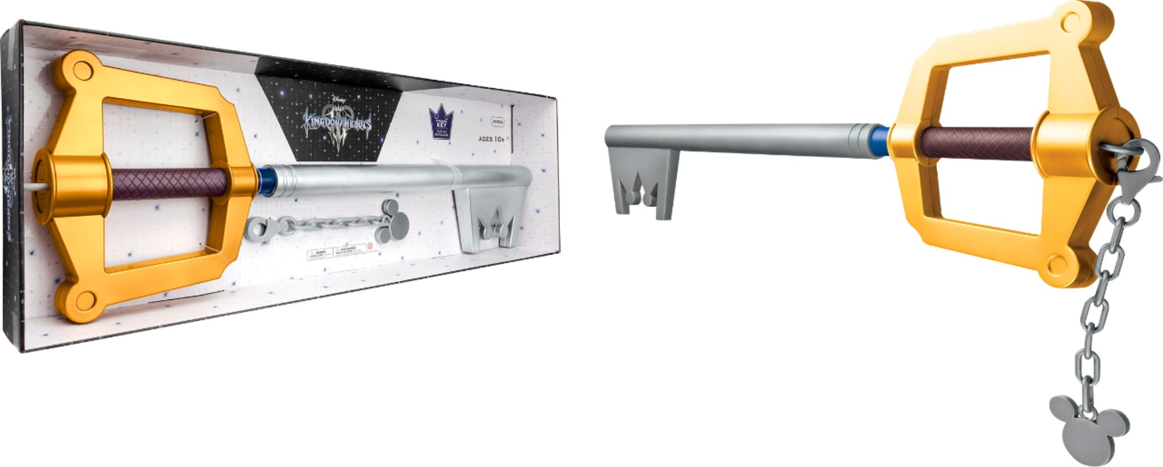


Schizo drawing in the middle to explain why I don't like most fantasy swords. I mean I think fantasy swords use cool looking materials which is fine. I just hate the big ass paddle shape and handles/guards that just get in the user's way or even hurts the user.
I was coming up with a more practical design for the keyblade so I drew a shitty doodle of a mace with a handle that will not block your wrist like the normal keyblade does.
Fantasy swords are very hit and miss. I never dug the way Final Fantasy VII did theirs, but Final Fantasy X did a nice job with making them pretty.
I was coming up with a more practical design for the keyblade so I drew a shitty doodle of a mace with a handle that will not block your wrist like the normal keyblade does.
Yeah the replicas look pretty weird to wield: 

The reddit topic I found this picture in is pretty funny over them trying to figure wtf is going on.
It's just the shape of these fantasy weapons where it's like no wonder Sora is as slow as he is with his attack and defend animations lol. Decorations and fantasy materials look nice just not the weird unrelatable shapes. You notice Sora relies on slashing horizontally with the back of his keyblade and that there is a lot of clipping that happens with the character and weapon model.
Also, his posture his terrible as you want to focus on using your legs and not lean so much even if he's fighting short heartless. Then you lead with your arm and weapon that gives you reach while leaning gives you little reach but leaves you a lot more open to reprisals and slows you down.
I like the saber top-left especially with the crossed hilt.
I was actually drawing a bit better in Microsoft paint lol because the defaults are nice but the accuracy was terrible. I then switched to Krita because the mouse/paint to point accuracy was bothering me.
It's just the shape of these fantasy weapons where it's like no wonder Sora is as slow as he is with his attack and defend animations lol.
Yet the dude can jump super high and has a ton of strength. It doesn't even weigh him down when he's gliding.
The keyblade is a strange situation, it's basically a club with a fucked up handle. That being said I really like how weird and dumb the weapon is purely for the Disney aesthetic. In general Disney likes their characters to be able to be understood by a mere silhouette, and that weapon does it singlehandedly.
Decorations and fantasy materials look nice just not the weird unrelatable shapes.
Yeah agreed. In general when games allow for customization I tend to go for minimalist designs that look plainer over how that'll stand out in a world of fantasy weaponry.
FFX's weapons though are a weird mid-ground: 

Also, his posture is terrible as you want to focus on using your legs and not lean so much even if he's fighting short heartless.
Some rationalize it as him having had no formal training, and further that idea by seeing how his stances adjust with each advancing game.
Riku by comparison stands like an actual swordsman.
Yeah but Keyblades actually do swing faster or slower depending on reach unless it's the Ultimate Keyblade that is fast and long. I'm not sure if it affects how fast Sora is movement wise although it seemed that way to me. Sora also takes forever to swing even with the fastest Keyblades. Even with superhuman strength and speed it still makes more sense to have an effectively shaped weapon. The keychain along with the crossguard on a blunt weapon already stands out. The Final Fantasy weapons are still just weirdly shaped. I actually really like the Buster sword for the unique tanto edge but it's just way too wide, those are swords aren't bad about width but the shape is terrible with unnecessary weight or spikes in the wrong places or that dumb split sword.

